
Cement Bag Printing — What Survives the Supply Chain
A cement bag is printed once and then abraded for the rest of its life — by the bag above it, by strapping, by a forklift, by a yard. Print that looks excellent on a proof can be unreadable by the time a bag reaches a building site, and the difference is mostly decided at artwork stage.

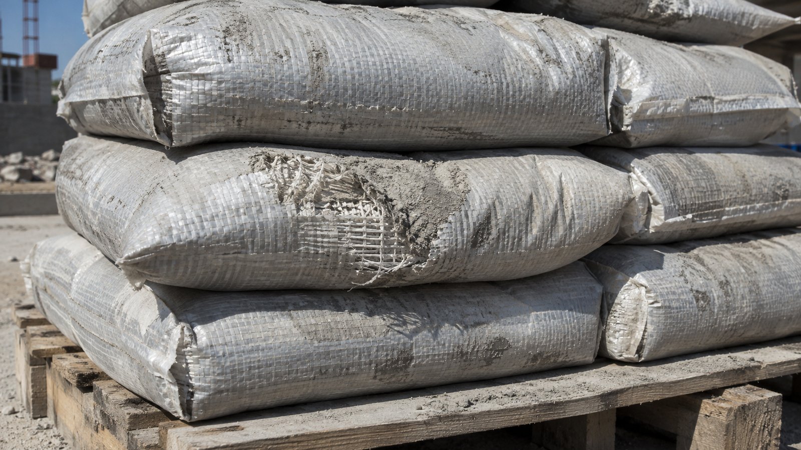
A cement bag is printed once and abraded for the rest of its life. It is stacked against other cement bags, strapped, moved by forklift, stored in a yard, and handled by people who are not being careful with it.
Print that looks excellent on a proof is routinely unreadable by the time the bag reaches a site. Most of that outcome is decided at artwork stage, not at press.
Why cement is the hard case
Two things make it worse than most packaging:
The product is abrasive. Cement dust gets onto the outside of every bag in the batch. Bags then rub against each other with an abrasive powder between them. That is a lapping process, and it polishes print off.
The handling is rough. Cement moves through a supply chain with no interest in the appearance of the pack. It is stacked high, strapped tight, dropped, dragged and stored outdoors under a cover.
Design for that, rather than for the proof.
Print directly on woven, or under lamination?
| Direct flexo on woven | Under BOPP lamination | |
|---|---|---|
| Print sits | On the exposed fabric surface | Beneath a film layer |
| Abrasion | Wears directly | Film takes the wear first |
| Detail achievable | Limited by the weave texture | High — a smooth substrate |
| Cost | Lower | Higher |
| Right when | Simple marks, bold type, cost-driven | Brand-facing, or detail must survive |
If the bag is sold through retail or merchant channels where appearance affects the sale, lamination usually pays for itself. If it is a trade pack going to a batching plant, direct print is often the right economic answer.
Design rules that survive
Avoid fine type
Small text is the first thing to go. Woven fabric has a texture that limits achievable detail even before abrasion, and once wear starts, fine type turns to noise. Anything that must remain readable needs to be set larger than a paper-packaging designer would instinctively choose.
Be careful with large solid areas
Big solid blocks of colour show wear more obviously than broken-up designs. A scuff across a solid field reads as damage; the same scuff across a textured or patterned area is far less visible. This is why so much industrial packaging uses bold graphic shapes rather than full-bleed colour.
Fewer colours, better registration
Every additional colour is another registration tolerance. On a woven substrate moving through a flexo press, tight registration across many colours is harder than on film. Designs that rely on precise registration between colours are the ones that look wrong across a production run.
Repeat critical information
Product identity, grade and any safety information should appear in more than one place on the bag, and not only on the faces that take the most abrasion in stacking. If the only place the grade is printed is the face that rubs against the bag above, you will have bags in the field nobody can identify.
Where abrasion actually happens
- The top and bottom faces, which contact adjacent bags in a stack
- Under strapping lines, where pressure and movement combine
- Edges and corners, which contact everything
- Anywhere a forklift tine passes
The side faces of a palletised stack survive best. That is where information you need to remain legible should go.
Proof against reality, not against a screen
Approve artwork by looking at a printed sample on the actual substrate, not a digital proof. Colour renders differently on woven polypropylene than on coated paper, and the weave texture affects how fine detail resolves.
If you can, take a printed sample and abrade it deliberately — rub it against another sample with some cement dust between them. Ten seconds of that tells you more about how the design will age than any amount of on-screen review.
What to send with an enquiry
- Artwork as print-ready PDF or AI, fonts converted to outlines
- Number of colours, with PMS callouts
- Whether the bag is trade or retail-facing
- Whether bags are stored outdoors at any point
- Which information must remain legible at point of use
That last one drives placement, and placement drives whether the print does its job.